Can't Argue With Contrast!

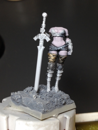
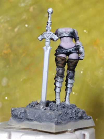
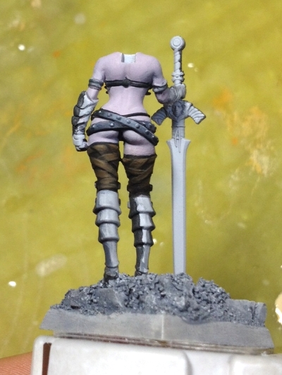
Have you ever heard "You could really use some more contrast on the  ____"? Yeah, me too. It's a horrible shouty-voice in my head that keeps pushing me to paint my shadows darker and my highlights lighter. I can't argue with the results, but it takes quite a while to blend smoothly. I'll get faster, but I need to focus on "seeing" how to incorporate more contrast in my figures. Previously, I'd see a model and think "Wow, that really 'pops'! How did they do that?" Now I understand that it's really about high contrast and using a wide range of dark & light values. While there's something to be said for being true to textures (for example, rugged leather won't contain nearly as many different values as a reflective silk), I want to experiment a little more. I decided to do a side-by-side comparison just to see how much I could push things visually. 

Here are the Reaper paints I used:

  • Brown Liner
  • Olive Skin Shadow
  • Linen White

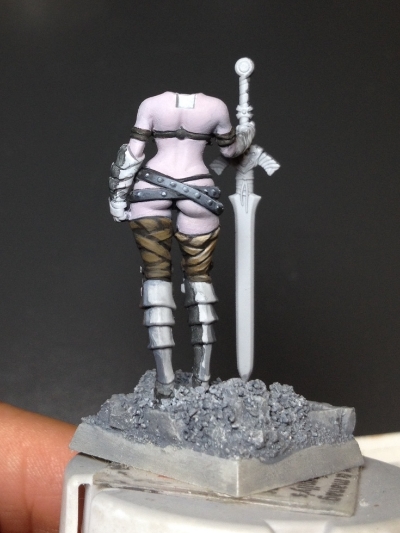
I painted the entire section of upper leg wrap in Brown Liner and then painted the individual sections with "Olive Skin Shadow" as the base coat. I went back in with Brown Liner to clean up and differentiate the wrap strips. I mixed about three progressive shades in between Olive Skin Shadow and Linen White to achieve smoother blending, continuing to push all the way up to pure Linen White for the upper edges. In the back view below, you can see a big difference between the flat base coat and liner version I started with. You can't argue with contrast!

Bailey WIP · Gold Non-Metallic Metal

I'm a fast learner. I'm also a perfectionist. If something doesn't look right, it bothers me and I can't move on until I fix it. A few nights ago I did a study in Gold Non-Metallic Metal. While I've practiced Gold NMM a few times on a lady barbarian and a Minotaur, I've never felt I've quite gotten it right. I've always wanted a subdued, greenish-"muted gold" (in fact, it might even be classified as bronze at this point). In any case, I tried two different approaches recently:

  • Start with the darkest color and highlight up from there, using a less-colorful, more realistic color scheme. 
  • Start with second-brightest highlight and shade down. Use a colorful, fantasy-inspired yellow-orange palette. 

After writing about my Miniatures from 2014 and seeing how far I've come in the past year, I wanted to select a mini that I've painted before to see the difference in skill level. I chose one of my favorite Reaper sculpts from Werner Klocke, Bailey Silverbell. I painted her in 2012-- Bailey was the second miniature I ever painted. I love this sculpt and I wanted to try some challenging techniques this time around. Focusing on what I learned from my Gold NMM studies, here's what I came up with after painting the armor sections on each hip:

I even added a small dent in a section of the armor to give it some additional interest. However, after studying the images I posted to Twitter, I realized one side looks much better than the other-- the colorful version like she's wearing a breakfast pancake on her hip and I didn't paint nearly enough contrast to make it look like convincing NMM. I've seen some beautiful colorful NMM before, but after this study, I decided I like the worn, hammered metal armor look. Since I wanted the armor to match the better result, I painted over the "pancake" armor to make it consistent with the other section of armor.

After that, I started painting her knee and shoulder guards using the same approach. While the blending took a considerable amount of time, I'm extremely happy with the results. I've never been happy with NMM like this and I'm so pleased to have results I'm proud of! Her cloak is still only in the base coat phase and I'll still need to paint highlights on her bodice leathers-- she's only 30-40% complete, and it's about time to attach her right arm that holds a dagger. Plenty more to paint on this miniature!

Wobbly Wednesday

Last week I was totally irresponsible. After mourning two family members in the last two months, moving to a new city while paying for two places until new tenants move into our old place (and dealing with our soon-to-be-former landlord's rude realtor), our new house flooded Monday. I give up. Since I wasn't going anywhere and the squishy wood floors and the deafening industrial floor fans were driving me absolutely crazy, I drank too much wine and painted late into the evening. I may have taken some goofy miniature-painting selfies. Yeah, that happened.

I also couldn't make any decisions-- I had been making them all day at work and at home, so when I sat down to paint, I was mentally and creatively exhausted. I still forced myself to paint so I asked other people to make them for me: 

"What should I paint first?" [the little one]

"I think I'm going to paint her cloak red & purple. Does that sound good?" [sure]

"What color should her eyes be?"  [green]

"Should she have makeup? [yes] What kind?" [Bold red lips]

It may sound silly, but that idea was the key to unlocking a Paint-By-Numbers approach that didn't tax my brain. I was able to paint late into the night and not be emotionally-attached to my mini. Otherwise, I second-guess my decisions and become extremely frustrated if it didn't turn out the way I originally envisioned. 

Here's where I was just getting started on the miniature face...

...and where I ended up at the end. 

She's a little chunky in the face and her mouth is a bit sloppy but I have to say, she turned out better than expected (especially considering the amount of wine consumed during that paint session). It was fun, but not something I'll repeat any time soon-- that next day was rough! I've painted a bit more on her since then and cleaned up the corners of her mouth. I love painting leather and skin, so that's what's next before I tackle any metals. I'm going with a Little Red Riding Hood theme on this one and I'm looking forward to painting her more tonight. 

LOL check out the cat fur that's found its way onto to the sticky base